Practice Review – Thyroid disorders: when and what to test
Australian GPs recently received a Practice Review on thyroid testing. Find out more about how to read your practice review.
Key points
- Reflect on your practice and your requests for thyroid blood tests and imaging
- Reflect on your data in relation to your patients and their indications for pathology and imaging
- Access a sample report
About the Practice Review
The Practice Review is a four-page report regularly mailed to GPs in Australia. Its purpose is to support you in your professional development and quality improvement. Each report focuses on a specific clinical area and includes:
- background information about the clinical area of focus
- your individual data on the dispensing of PBS medicines you prescribed, or the MBS tests that you ordered
- evidence-based points for reflection
- aggregate data of GPs working in similar practices across Australia for comparison.
Download and print a sample report
How have your requests for thyroid tests changed over time?
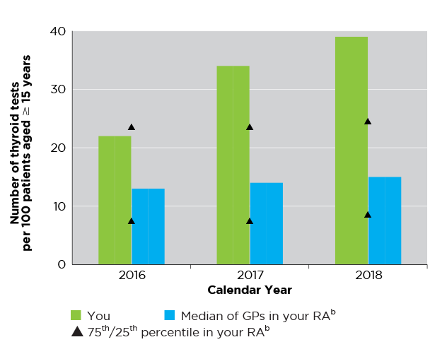
Figure 1: Read an accessible version of this graph
What does this graph show me?
- Figure 1 shows the total number of thyroid tests (TSH only and full TFTs) that you requested and that were performed, expressed as a rate per 100 patients (aged ≥ 15 years). Note, the data do not reflect actual numbers of thyroid tests or patient numbers.
- The rate of thyroid tests per 100 patients (aged ≥ 15 years) is shown for calendar years 2016, 2017, 2018.
- Numbers have been adjusted to represent a rate per 100 of your patients (aged ≥ 15 years) to provide relative comparisons. The median, 25th and 75th percentile of GPs in your RA is shown.
- The purpose of this graph is to show the trend in your requests for thyroid tests compared to your peers.
I have an asterisk on my graph, what does this mean?
- This graph is scaled to fit data from 95% of all GPs.
- An asterisk on a column in the graph indicates that your rate of requests for tests, in that year, was higher than 95% of all GPs.
My data do not look as I’d expect, why could this be?
The number of thyroid tests you requested that were performed, is expressed as a rate per 100 patients to allow for comparison between GPs with varying numbers of patients.
If your rates of thyroid tests per 100 patients are higher than you expect, this may be because:
- your total number of patients is lower than the average when compared to other GPs in your RA.
For example, if you
- requested a total of 300 thyroid tests for your patients in 2018
- have 500 patients in your practice
Similarly, if your rates of requesting thyroid tests are lower than you expect it may be because:
- you have more patients in your practice than the average.
For example, if you- requested a total of 300 thyroid tests for your patients in 2018
- have 3000 patients in your practice
- requested a total of 300 thyroid tests for your patients in 2018
- You are requesting thyroid tests, but your patients are not having them performed.
Help me reflect on my data
- Has my rate of requesting thyroid tests increased or decreased over the last 3 years? Why might this be?
- How does my rate of requesting for thyroid tests compare to my peers?
- Do I use TSH/TFTs as a screening test in asymptomatic patients?
- What patient factors do I consider when requesting a thyroid test?
What percentage of your thyroid tests were for TSH alone in 2018?
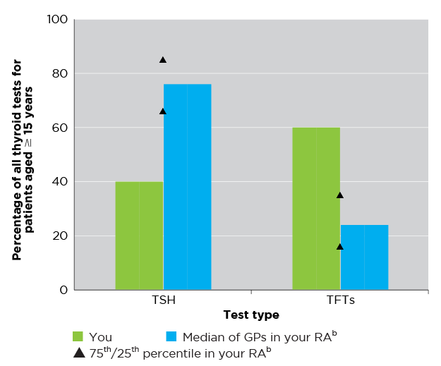
Figure 2: Read an accessible version of this graph
What does this graph show me?
- This graph shows the proportions of the thyroid tests your patients (aged ≥ 15 years) underwent that were for:
- TSH (alone)
- TFTs.
- The sum of the percentages of the TSH and TFTs are likely to total 100% subject to rounding.
- Data for the median, 25th and 75th percentile of GPs in your RA is also shown to allow you to compare your data to your peers.
- The purpose of this graph is to show you what kinds of thyroid tests you request.
My data do not look as I’d expect, why could this be?
- This graph shows the percentage breakdown of thyroid tests you requested that were subsequently performed. If you referred your patients for thyroid tests, but they didn’t have them performed (in 2018) then they will not be included in this graph.
Help me interpret and reflect on my data
- Do I order a TSH test in the first instance?
- How do my requests for TSH tests compare to those of my peers?
- What is my approach to requesting thyroid tests for my patients with suspected thyroid disorders?
- How can I change the settings saved in my clinical information systems to ensure that a TSH test can be ordered by itself?
Did your patients receive multiple TSH tests in 2018?
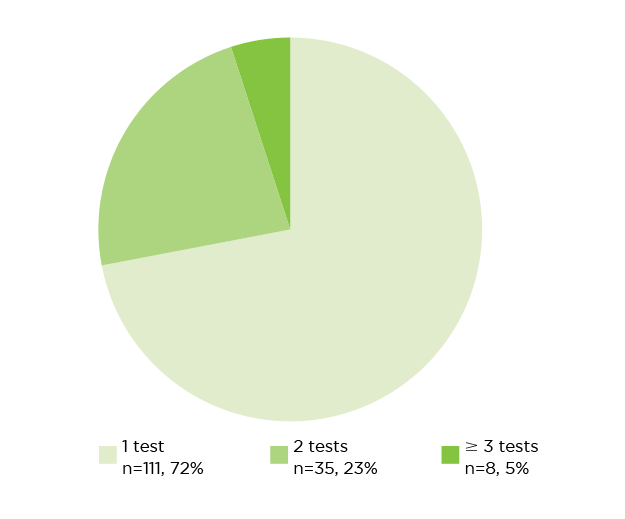
Note: Due to rounding, percentages may not total 100%. n = number of TSH tests (TSH tests as part of TFTs are not included in this chart).
Figure 3: Read an accessible version of this graph
What does this chart show me?
- This chart shows of all your patients (aged ≥ 15 years) who had a TSH test in 2018, the number and percentage who had:
- 1 TSH test
- 2 TSH tests
- 3 or more TSH tests.
- The purpose of this chart is to show you how many patients are having multiple TSH tests to help you reflect on how often you repeat TSH tests.
My data do not look as I’d expect, why could this be?
- TSH tests can either be requested alone or as part of TFTs. This chart only includes TSH tests requested alone and does not capture TSH tests requested as part of TFTs. For example, if a patient had a TSH test in January 2018, and then a TFT in June 2018, only the TSH test from January 2018 will be captured in this data.
- The data capture tests for TSH alone performed in 2018. Tests ordered during 2017 but performed in 2018 will be shown in the chart.
Help me reflect on my data
- What proportion of my patients received 2 or more TSH tests in 2018?
- Under what circumstances do I request repeat TSH tests?
- How often do I repeat TSH tests for my patients following a normal result?
How many of your patients had neck ultrasounds in 2018?
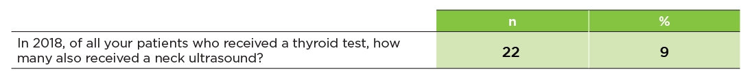
Figure 4: Read an accessible version of this table
What does this table show me?
- This table shows, of all your patients (aged ≥ 15 years) who received a thyroid test in 2018, how many also had a neck ultrasound performed in the same year. This is expressed as a number and percentage of all your patients (≥ 15 years) who received a thyroid test in 2018.
- The purpose of this table is to give you an indication of your ordering of neck ultrasounds for patients who have undergone thyroid testing.
My data do not look as I’d expect, why could this be?
- Only patients who received a thyroid test and a neck ultrasound in 2018 are included. For example,
- if a patient received a thyroid test in December 2018, and a neck ultrasound in January 2019, they will not be included.
- if a patient received a neck ultrasound in 2018, but did not receive a thyroid test in 2018, they will not be included.
- As highlighted, while thyroid examinations are the main reason for neck ultrasounds, the specific indication cannot be determined from MBS data. Therefore, you may have patients who received a thyroid test in 2018, who you also referred for a neck ultrasound in 2018, however this could have been for an indication other than thyroid investigation. These patients would still be included.
Help me reflect on my data
- What factors do I consider when referring patients for neck ultrasounds?
- Do I always perform a neck examination to confirm palpable nodules or goitre before requesting a neck ultrasound?
Age profile of your patients
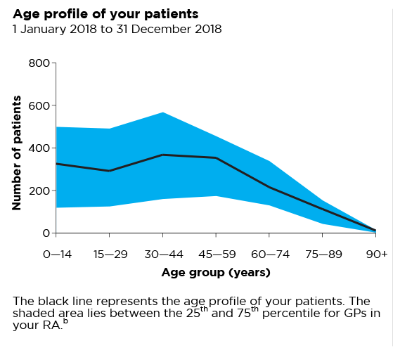
* Data values are outside the range of the graph
Figure 5: Read an accessible version of this graph
What does this graph show?
- This graph shows the breakdown by age group of the total number of your patients who received a category 1 (ie, professional attendances), category 5 (diagnostic imaging services) or category 6 (pathology services) Medicare benefit between 1 Jan 2018 and 31 Dec 2018.
- The purpose of this graph is to give you a snapshot of your patients to help you interpret your data.
- The shaded blue area lies between the 25th and 75th percentile for the age profiles of patients of GP practices in your RA.
- Your RA peer group is identified.
I have an asterisk on my graph. What does this mean?
- This graph is scaled to fit 90% of the data from all GPs.
- An asterisk on the age profile graph indicates that you have more patients within that age range, than 90% of GPs in your RA.
Your Medicare patients and concession card holders
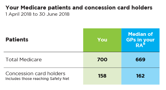
Figure 6: Read an accessible version of this table
What does this table show?
- This table reflects the number of unique patients that you have seen over a representative 3-month period.
- The table shows the total number of patients who received a category 1 (ie, professional attendances), category 5 (diagnostic imaging services) or category 6 (pathology services) Medicare benefit during this time.
- The total number of patients who used a concession card or safety net card to have a prescription written by you dispensed is also shown.
- The purpose of this table is to provide you with a snapshot of your patients to help you interpret some of the data presented in the graphs and tables in this report.
- This information is from 1 April 2018 to 30 June 2018.
- The median for GPs in your RA is also provided.
Frequently asked questions
I would like to know more
- Find out more about our national program and access a range of CPD activities and patient resources
- Read the MedicineWise News: Thyroid disease: challenges in primary care
- Download a copy of the Adult thyroid disorder testing algorithm
More questions? Want to give feedback?
Send us an email at [email protected] or call 02 8217 8700
References
- Medicare Benefits Schedule Review Taskforce. First report from the pathology Clinical Committee - Endocrine Tests. 2017 (accessed 14 June 2019).
- Department of Human Services. Medicare Item Reports. Canberra: Australian Government, 2018 (accessed 4 June 2019).
- Australian Commission on Safety and Quality in Health Care and Australian Institute of Health and Welfare. Third Australian Atlas of Healthcare Variation. Sydney: ACSQHC, 2018 (accessed 12 June 2019).
- Royal College of Pathologists of Australasia. Position statement: Thyroid function testing for adult diagnosis and monitoring. NSW: RCPA, 2017 (accessed 25 June 2019).
- Schneider C, Feller M, Bauer DC, et al. Initial evaluation of thyroid dysfunction - Are simultaneous TSH and fT4 tests necessary? PLoS One 2018;13:e0196631.
- Bone and Metabolism Expert Group. Therapeutic Guidelines: Thyroid disorders. West Melbourne: Therapeutic Guidelines Ltd, 2019 (accessed 25 June 2019).
- Durante C, Grani G, Lamartina L, et al. The diagnosis and management of thyroid nodules: A review. JAMA 2018;319:914-24.